7 Graph Maker Design Ideas For Your School Presentation
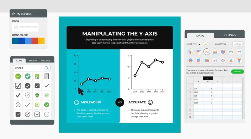
When it comes to school presentations, a graph maker can be a lifesaver. Not only do they help you organize your thoughts and data, but they also make it easy to present information that can captivate the attention of your audience.
Various graph makers are available, so finding the right one for your project can be challenging. To help you, we’ve put together a list of graph maker design ideas for your school presentation.
Table of Contents
Use a Pie Chart to Show Percentages
A pie chart is a great way to show percentages in your school presentation. For example, if you present data on test scores, a pie chart can help you see how different grades compare.
There is an online graph maker that you can use for free. Once you have chosen a graph maker, you must input your data. Typically, you will need to input the percentage of each grade of the entire data set.
After you have inputted your data, the pie chart maker will create the pie chart for you. You can then save the pie chart and insert it into your presentation.
Use a Bar Graph to Compare Data
A bar graph is a type of chart that uses rectangular bars to represent different values. Bar graphs are often used to compare data, and you can use them to present information in your school presentation.
When using a bar graph, it is crucial to choose an appropriate scale so that the bars are easily distinguishable. The bars should also be labeled so the audience can understand what each bar represents.

Once the graph is created, it is essential to interpret the data correctly. For instance, a bar graph might be used to compare the average test scores of two different groups of students. In this case, the height of each bar would represent the average score for each group.
The taller bar would indicate that the group had a higher average score. If you use a bar graph to compare data, ensure that you understand how to interpret the information correctly before presenting it to your audience.
Use a Line Graph to Show Change Over Time
A line graph is a great way to show how something has changed over time. For example, you could use a line graph to show the changing enrollment at your school over the past few years.
To utilize a line graph creator, you first need to gather data. Once you have your data, you can use a graph maker to create a visually appealing and easy-to-understand line graph.
Organizational charts are another type of visual that you can use to illustrate relationships between different elements. You could use organizational chart examples to show the structure of your school’s administration.
Use a Venn Diagram to Show Relationships Between Different Groups
A Venn diagram is a chart often used to demonstrate the similarities and differences between two or more groups of items. The diagram comprises a series of overlapping circles, with each ring representing a different group.
The degree of overlap between the circles indicates the similarity between the groups. For example, if two groups share many characteristics, their corresponding circles will have a large area of overlap.
In contrast, if the groups have few similarities, their circles will only intersect at a minor point. Venn diagrams can be used to show relationships between any type of data, making them a valuable tool for presentations and reports.

Use an Area Graph to Show How Different Parts Make Up a Whole
An area graph is a graphic used to display quantitative data. It is a two-dimensional figure that shows how different parts make up a whole. Area graphs are usually used to show how a quantity has changed over time or to compare different quantities.
For example, an area graph could be used to show your students’ population growth over time. When creating an area graph, choosing an appropriate scale and clearly labeling the axes are essential. Area graphs can be made using software such as Microsoft Excel or Google Sheets.
Use a Flowchart to Show How Something Works
A flowchart is a diagram that shows the steps in a process. Flowcharts are commonly used in business to help visualize a process’s work and can be a helpful tool for school presentations.
When using a flowchart in your presentation, choose a clear and concise layout that is easy for your students to follow. You should also label each step in the process, so your audience knows what is happening at each stage.
Conclusion
There are many different types of graphs that you can use to show data. The type of graph you use will depend on the kind of data that you have and what you want to show with your graph. Experiment with different charts to see which ones work best for you.
If you want to create the best school presentation using a graph creator or maker, visit Venngage. It has some of the best designs and templates that are perfect for how you want your presentation to be. Sign up now!

